bcd Associates webpage
designing and Turning a nuanced brief into a cohesive brand
BCD Associates is a startup consultancy group that provides strategic direction and investment guidance to founders and entrepreneurs navigating the complexities of building and scaling a business. My role was to design and develop a cohesive brand identity and website that translated the firm's expertise and values into a visual language that would resonate with their target audience.
Introduction
I was tasked with creating and setting up a website for a client who needed a well structured webpage for his startup consultancy business service in order to get more online exposure and showcase their team’s experience, services and competency.
Project objectives
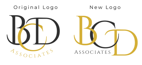
The objective was to design their webpage based on a loose color palette brief to create a simple, coherent and structured layout along with a logo that shapes their brand identity that is consistent throughout their page.
Discovery
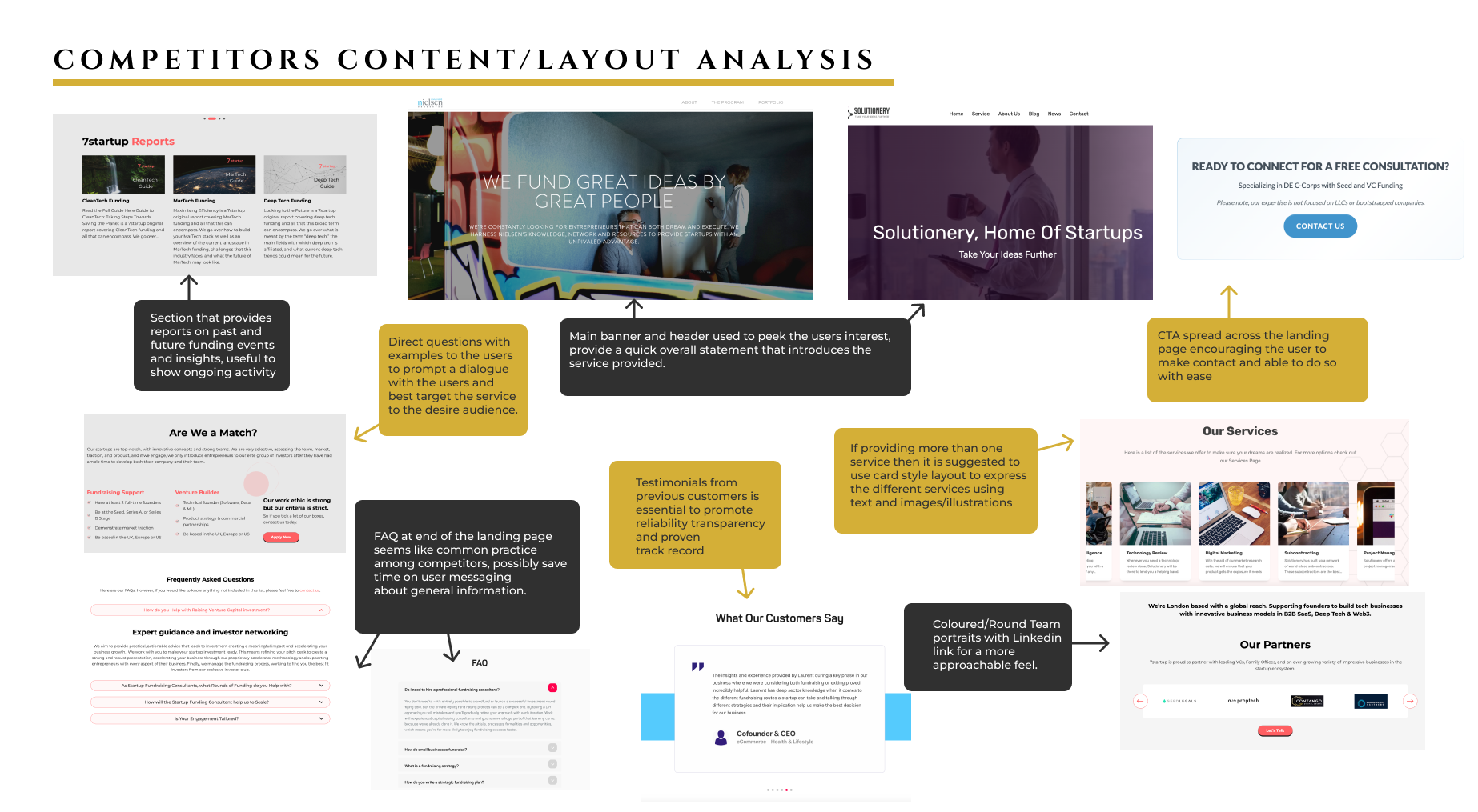
As so to better identify my client’s requirements I began by doing a competitor’s analysis to see what was already out there so that I may provide a webpage that is covers all the main sections content that should be included in the single page website, providing a layout that flows in a seamless and coherent way.
The company’s target audience are entrepreneurs who require support with their business development therefore I carried out a short survey that was filled in by 10 participants, collected though a group of angel investors network for which I previously work for and had made contact with in the past.
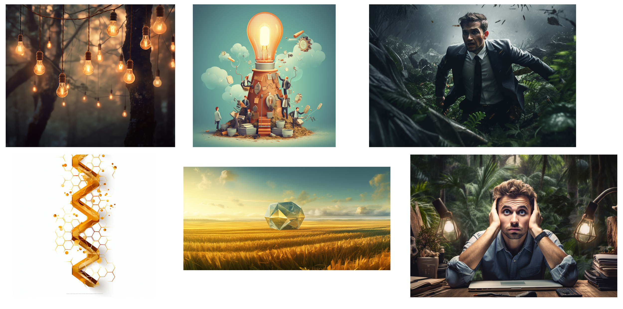
At the time of conceptualizing the website the client asked if we could use AI to create images to support the message they wanted to convey to their users. The message was one of providing direction and fostering the idea of growth, alluding to the thought that navigating the investment space can feel overwhelming by its complexity and the general lack of directions some might feel when trying to tackle it or as my client liked to put it “the investment space can sometimes feel like being lost in a jungle of information”. With this in mind I attempted prompting several images using Midjourney so that they might be used to describe those feeling and imagery/metaphor.
The results showed that the top priorities for them and their non-negotiables were: Trust and Credibility (97%) , Service Clarity (87%) and Easy to contact (82%). While Social Proof and Awards (48%) was seen as low-priority. Other things which scored in the middle were Investor Network (69%) and Educational Content (65%).
These results combined with the competitor’s analysis helped better guide and structure the webpage layout, content and overall flow of the page.
define
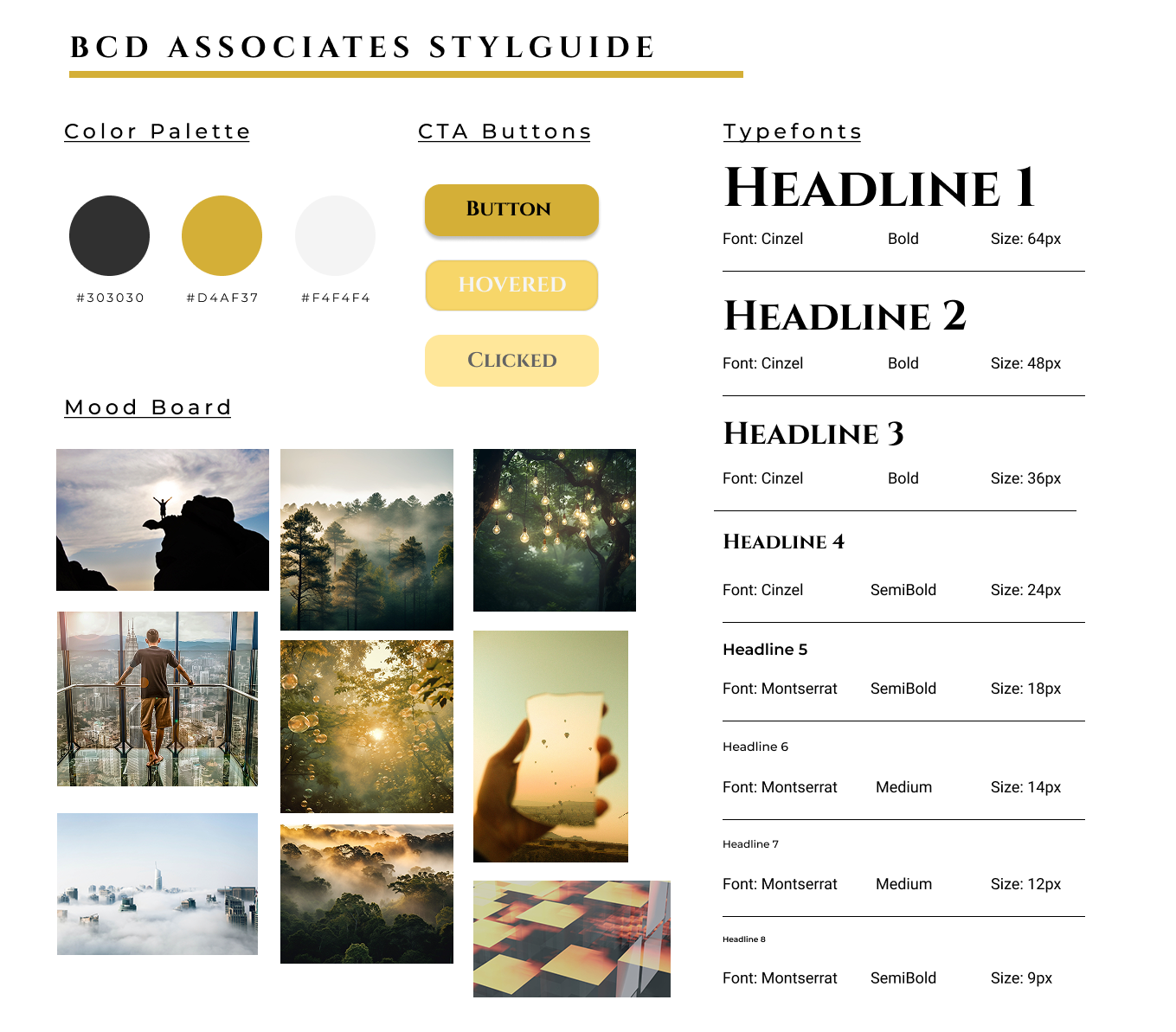
The color scheme was based off the the description provided by the client who wanted to showcase precision, value and clarity. The charcoal color was chosen to give a less harsh tone to black and reflect precision as well as sophistication and expertise which can be argued to be the cornerstone of any consultancy. The golden yellow although is usually interpreted as a sign of luxury and wealth, it can also be associated with value and excellence. The warm off-white can be associated with clarity and transparency but also help complement the other two colors by providing breathing space for the webpage.
For the type fonts, Cinzel for the headers was chosen for its classic use in financial institutions as well as giving a sense of being grounded and enduring. Paired with the gold color it carries a sense of earned prestige. The Montserrat font for the body was chosen for it’s modern and accessible feel, and when paired with Cinzel it conveys both modern and classical themes, understanding market history but thinks in a framework that is built for today.
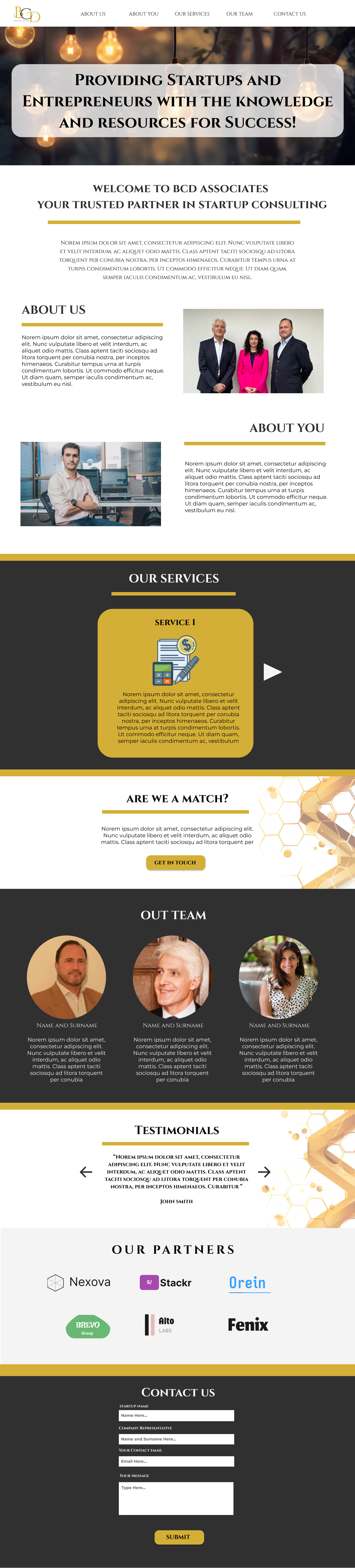
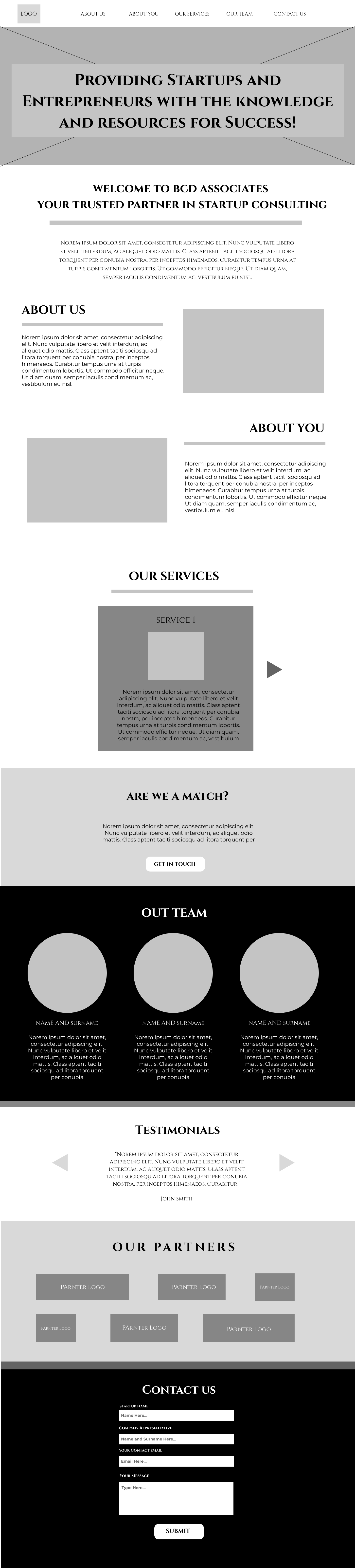
Low-Fidelity Wireframe - BCD ASSOCIATES
PROJECT SUMMARY
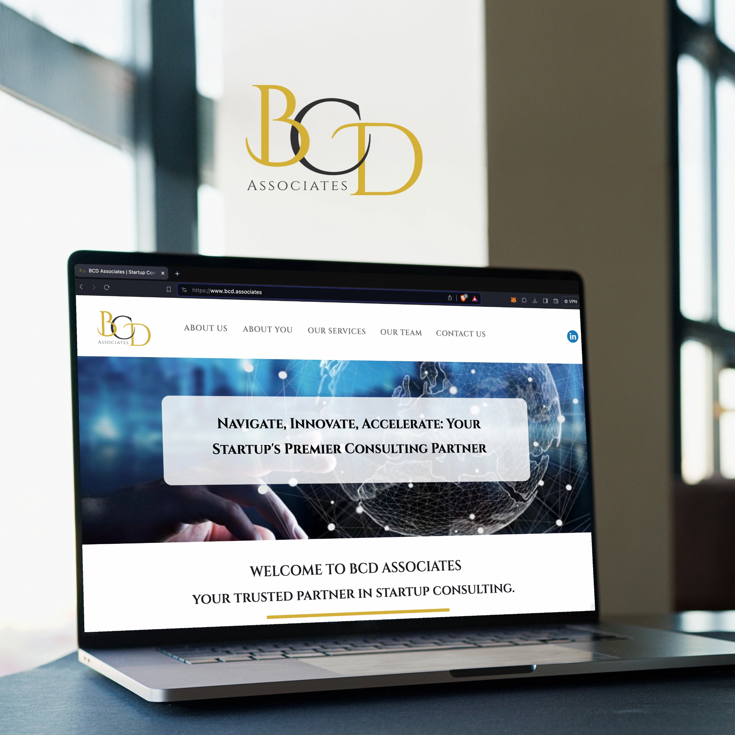
Having completed and presented the high-fidelity wireframes to the client, the design was accepted and I proceeded to build the webpage on Webflow.
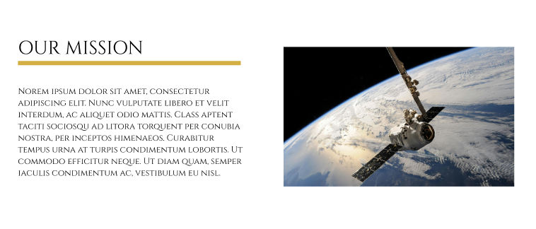
Originally my client was pushing for the use of AI images rather than photographs due to wanting to articulate their services through metaphors and emotions as from their point of view the overwhelming complexity of the investment landscape is not a place but a state of mind, and this is difficult to capture or find in stock images. In the end after many prompt later, the idea revealed that the concept needed a different solutions. An example of this was to push forward existing and real images that could convey similar meanings, for example using a photo of a satellite in space.
While the AI images could be used as a metaphor dressed as an atmosphere I argued that the satellite image gave a function dressed as a metaphor making it more meaningful rather than decorative.
High-Fidelity Wireframe - BCD ASSOCIATES