SOPHIA BUSINESS ANGELS WEBSITE
Connecting
Startups with business angels
The project centered on the redesign and development of Sophia Business Angels' website, along with rebranding efforts. The result was an improved user experience, enhanced engagement, and a fresh representation of Sophia Business Angels' activities.
introduction
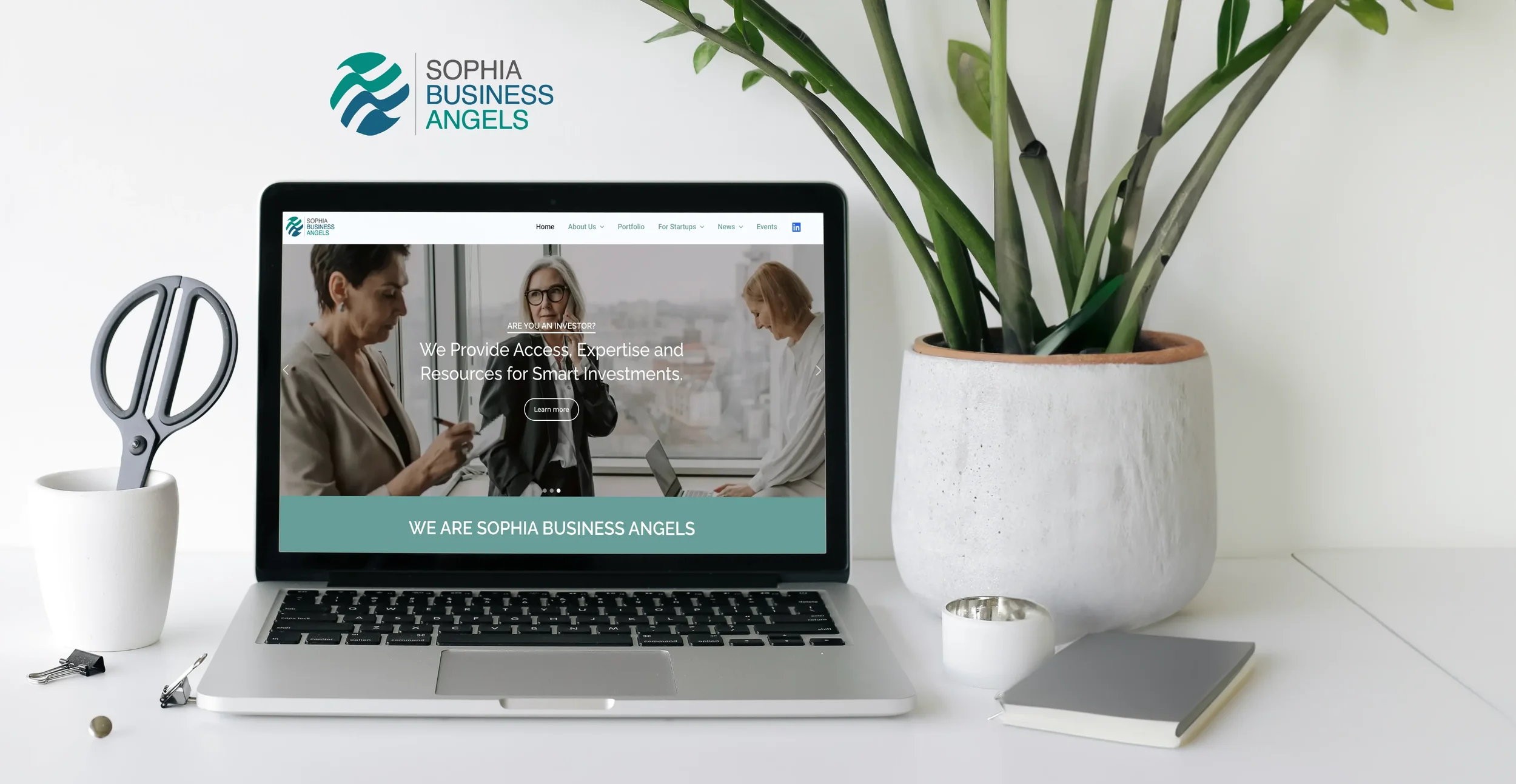
In celebration of Sophia Business Angels' 20th year anniversary, I was entrusted with two pivotal tasks: designing and developing a brand-new website with a strong focus on user experience, and revitalizing the company's brand voice, tone, and image.
Problem Statement
The existing website suffers from an outdated design that fails to effectively represent the company and its current members. Additionally, it presents significant challenges in terms of user flow and overall navigation architecture. Moreover, the lack of technical maintenance over an extended period raises concerns about overall security and makes implementing changes extremely difficult.
Project Objectives
The objective is to rebrand Sophia Business Angels in a manner that best captures the essence of the company and its members. The official website will be redesigned to provide a fresh and approachable feel while improving user journey and task flow to deliver a clear and well-informed user experience.
The website will prominently showcase SBA's activities through up-to-date investment success stories, accessible insights from current angels, and a calendar of events for all visitors.
DISCOVERY
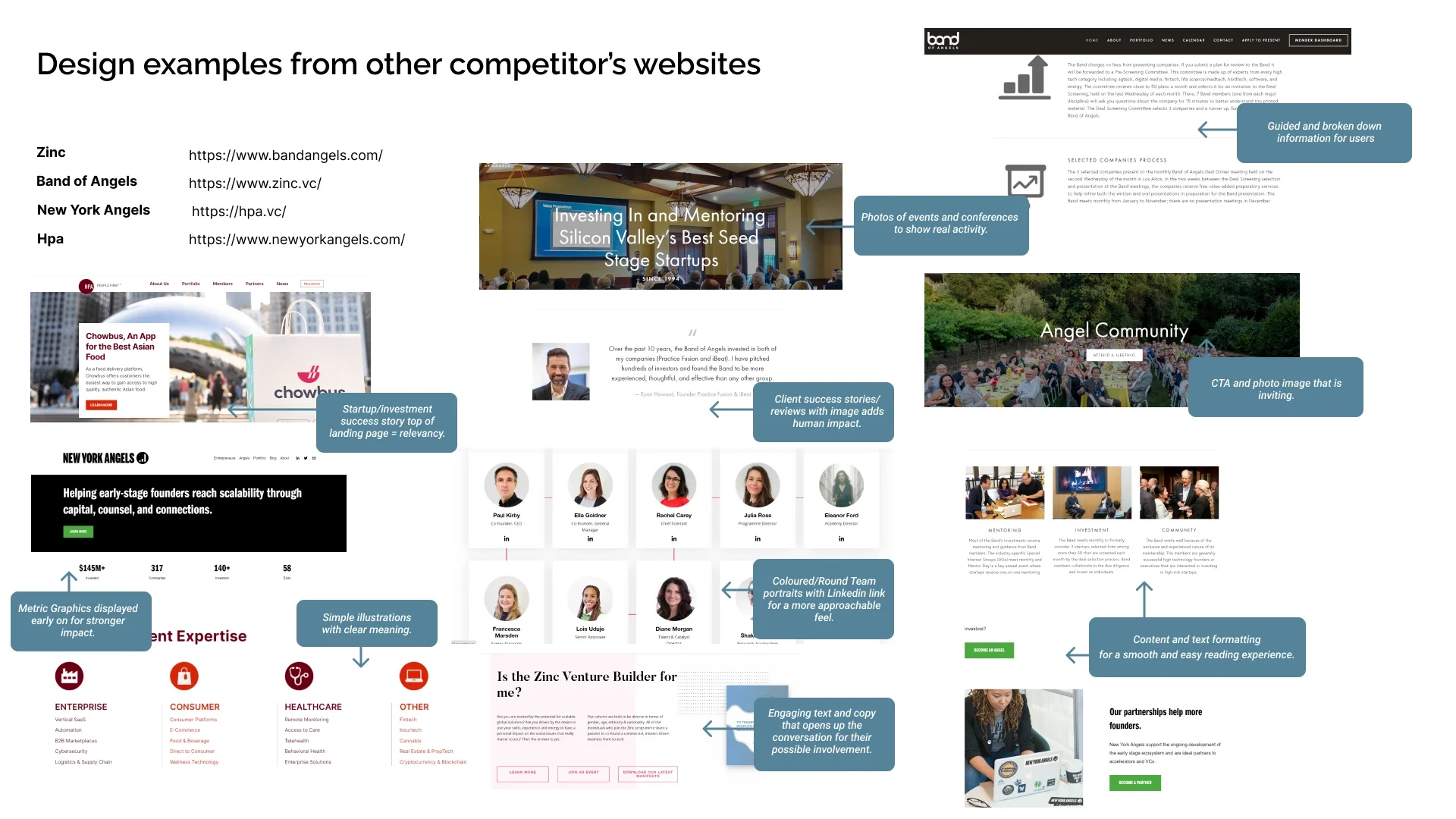
Working closely with the Communications Director, I began by conducting a heuristic analysis of the current website to identify usability issues. This analysis enabled effective communication wit the client regarding necessary improvements and facilitated a rethink of the website navigation and user task flow. Additionally, I conducted design research on other venture capital websites to gain insights into industry trends as well as sending out a short survey to the SBA members to better understand what were their main needs when navigating the website.
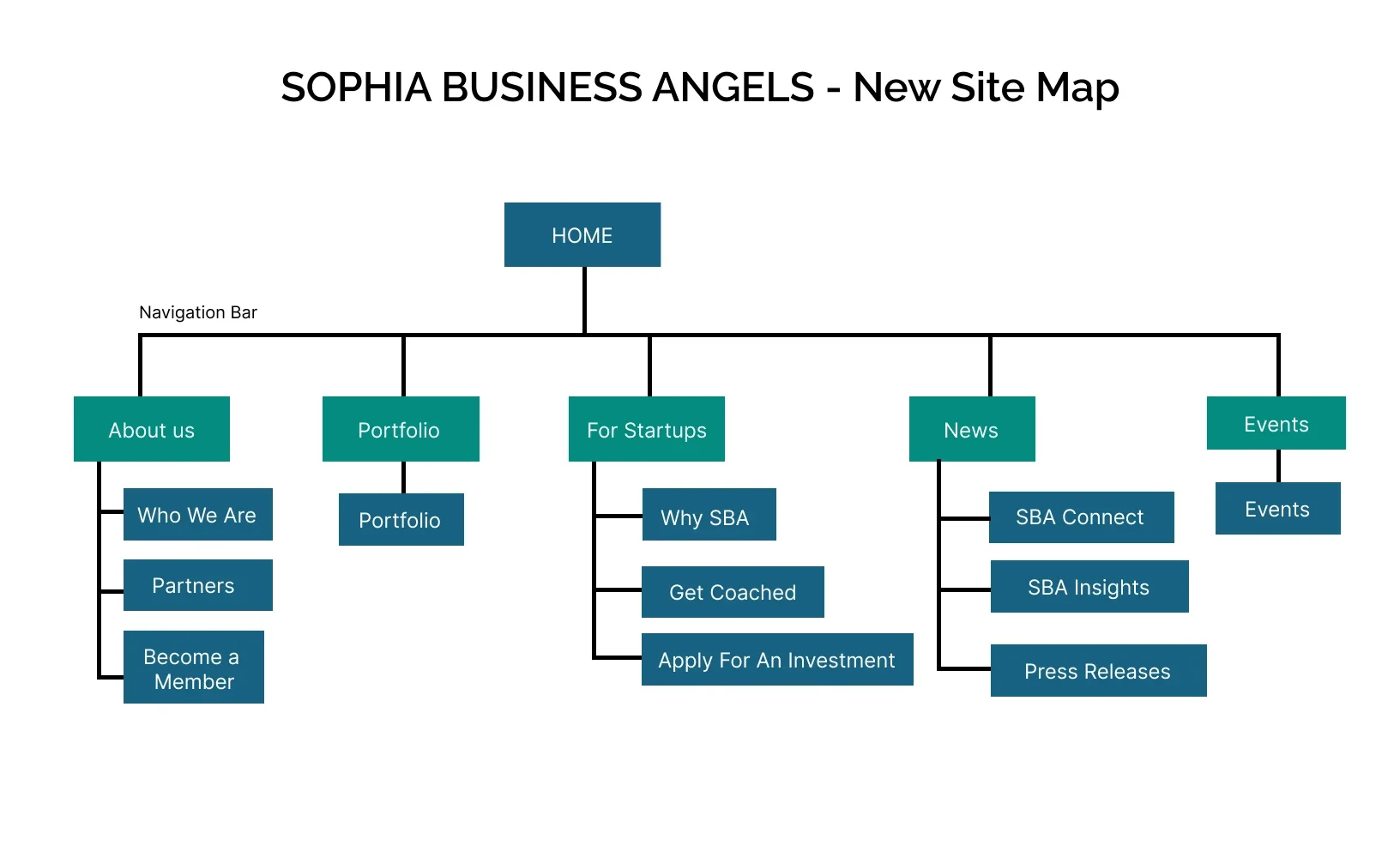
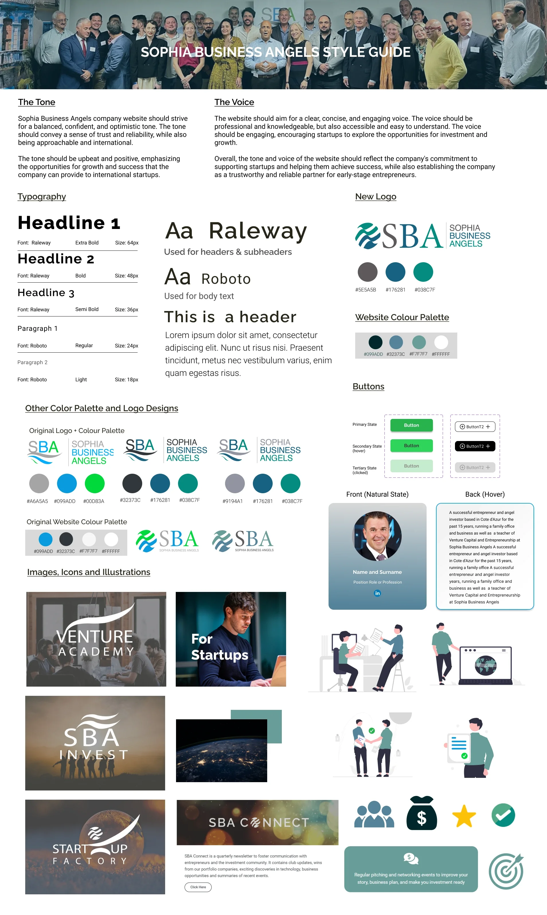
This lead to establishing the information architecture as well as identifying user task flows, and working on the low-fidelity wireframes while simultaneously working on defining the new style, voice, and tone for Sophia Business Angels.
DEFINE
As previously identified there are two main user flows for the website, Entrepreneurs and Prospecting Investors. For the 'Apply for an Investment' page, I wanted to deliver all the necessary information needed in a digestible way by clearly breaking it down in steps, accompanied by illustrations to make the page be more appealing and more accessible to the user. In the 'Who We Are' page to display the members profiles, While consulting with the client, they had asked if it was possible to display a short 100 - 150 words summary for each member to highlight their professional career and experience.
After some design tests, I reasoned that the best solution for this was to design the member profiles in flip card style. This not only made the page more interactive but also made it easier to deliver large text content.
In order to better showcase the company's start-up investments, the 'Portfolio' page was moved to the main navigation bar and at the top of the page, I added a section that could be used to highlight the latest start-up success stories. My reasoning for this stemmed from the survey research I previously did where the members wanted to show their strong commitment and support to those that have applied for investments with them as well as provide a more meaningful insight on the impact the company are making.
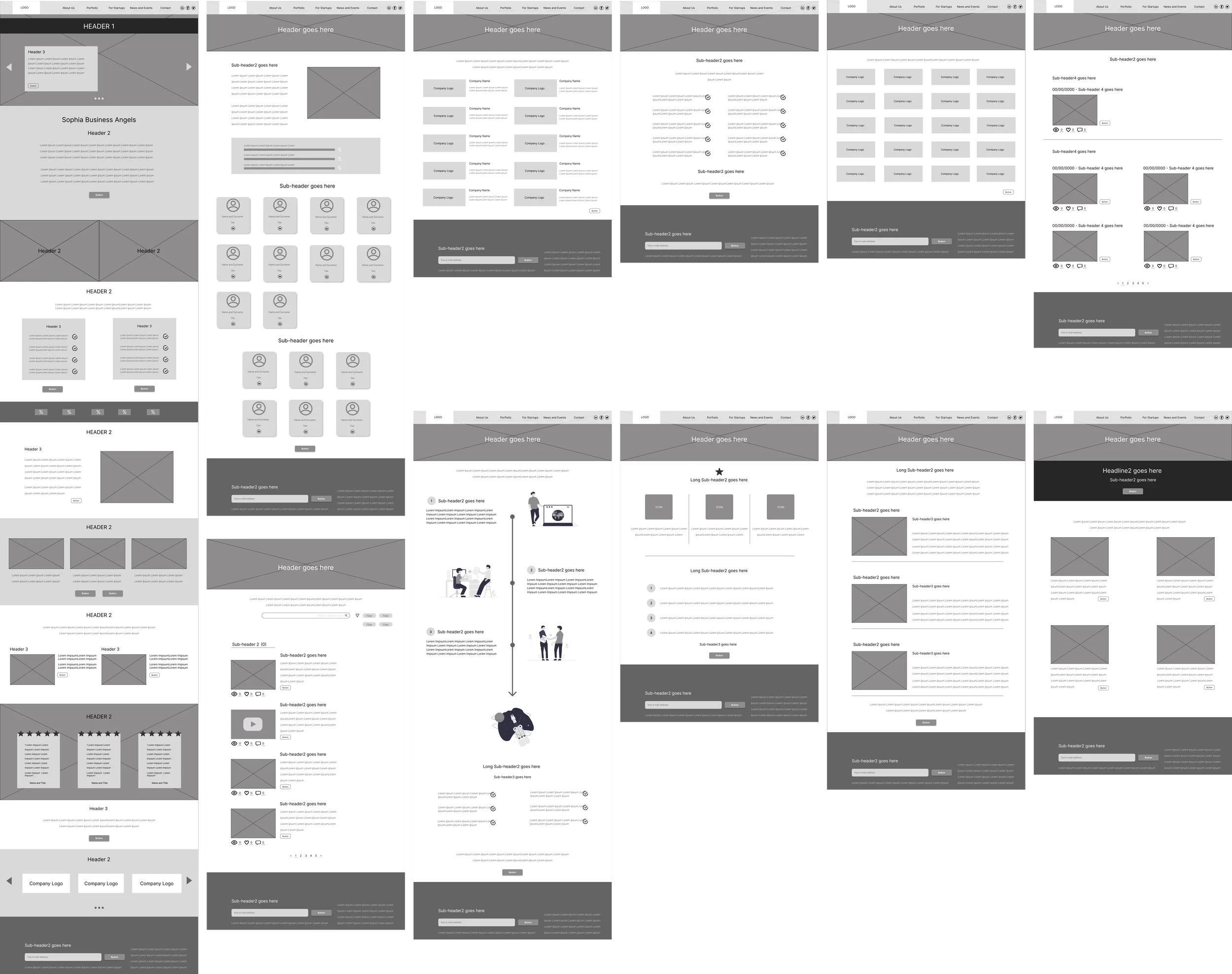
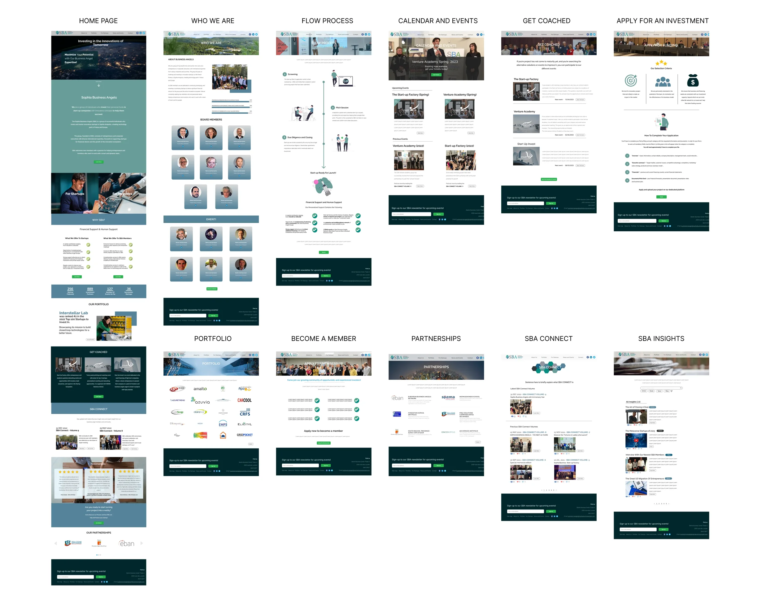
Another significant improvement was the inclusion of a newsletter subscription option in the footer of each page. The previous subscription process was difficult to find, resulting in a low number of monthly subscribers. The addition of this prominent feature enhances accessibility and encourages greater engagement.
The reasoning for this that previous subscription process was difficult to find and access which in turn caused the number of monthly new subscribers to constantly being very low.
Building the website
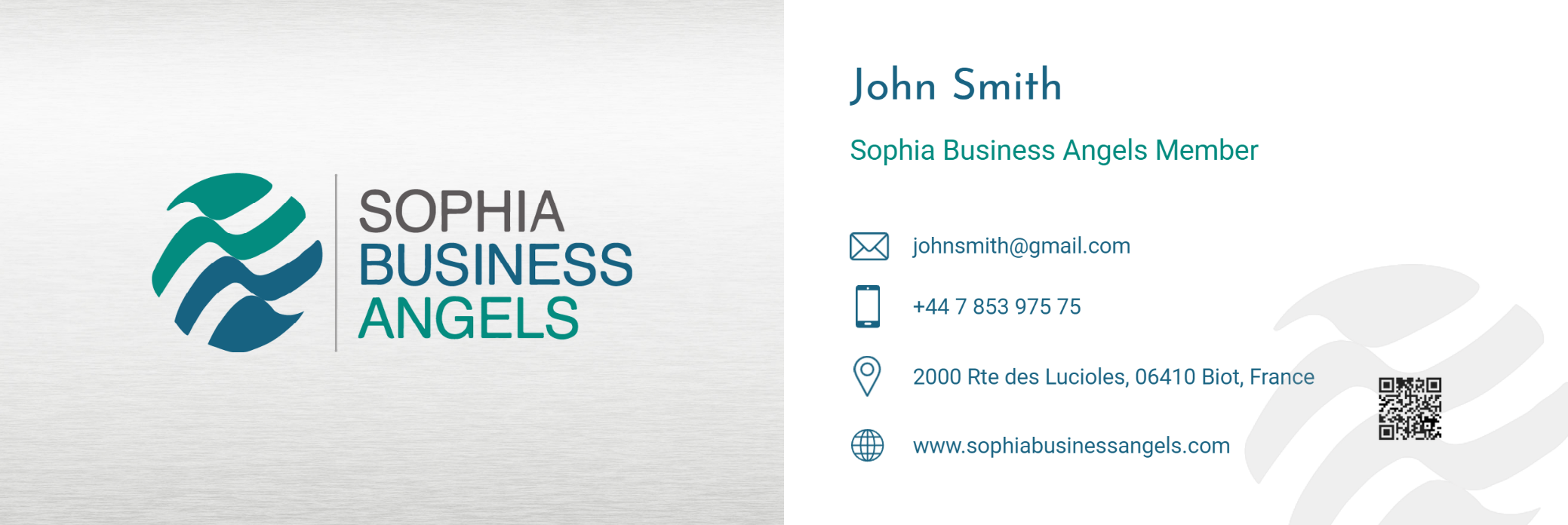
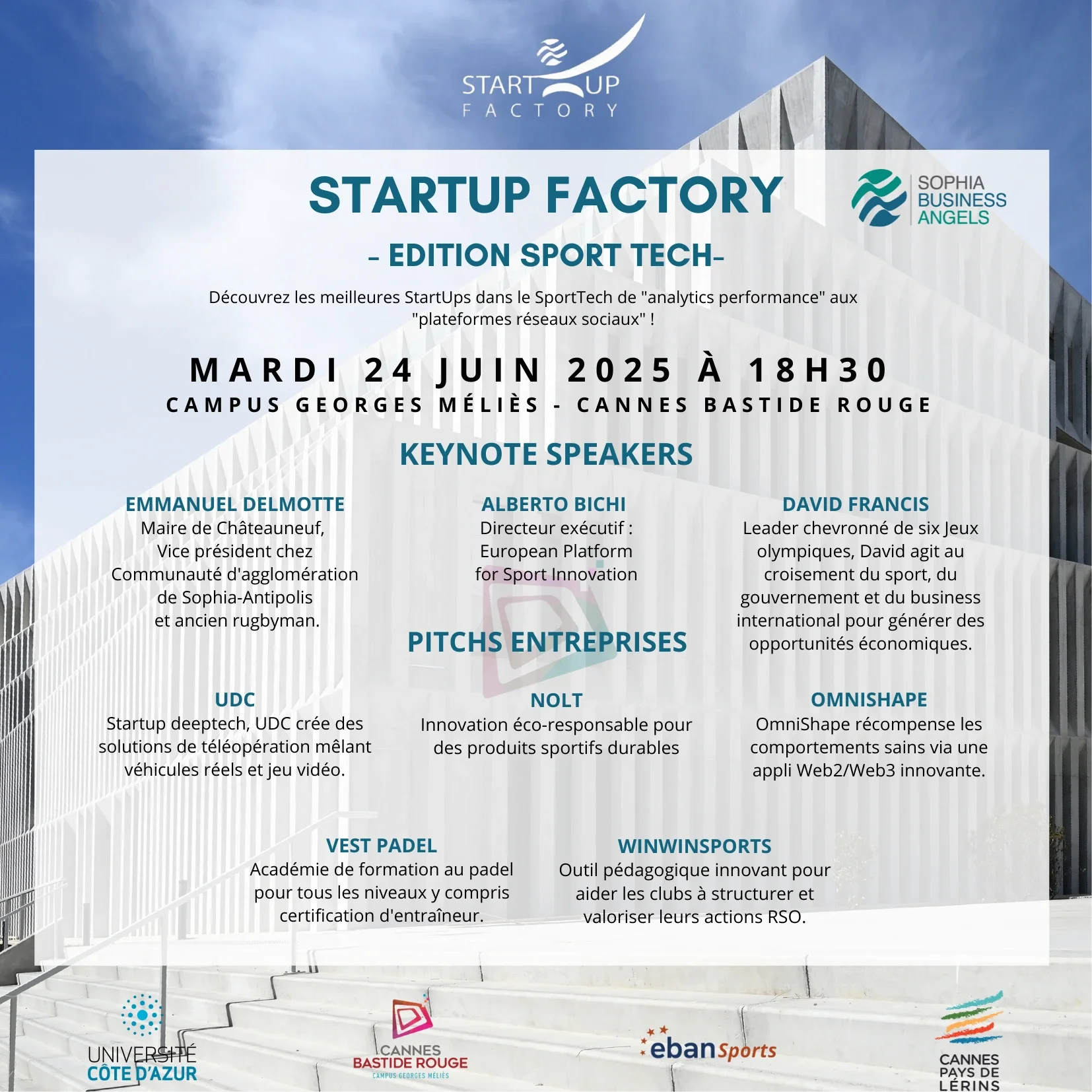
Once the website had been completed and successfully published, I would later continue to provide graphic and design support which included marketing brochures, event invitations, business cards, trophy graphics and bi-annual newsletters.
I would also continue to keep the content of the website updated, managing a lot of the admin work and eventually was asked to take up the position of part-time business manager for the client as by then I had gained the full trust of my client and outperformed in my initial role, showing growth and my willingness to take on new responsibilities.

member’s area Ad-ON pROJECT
As time passed, the success of the website and the SBA moving away from it’s external deal flow platform due to rising costs; my client requested to develop a private member’s area integrated within the existing website.
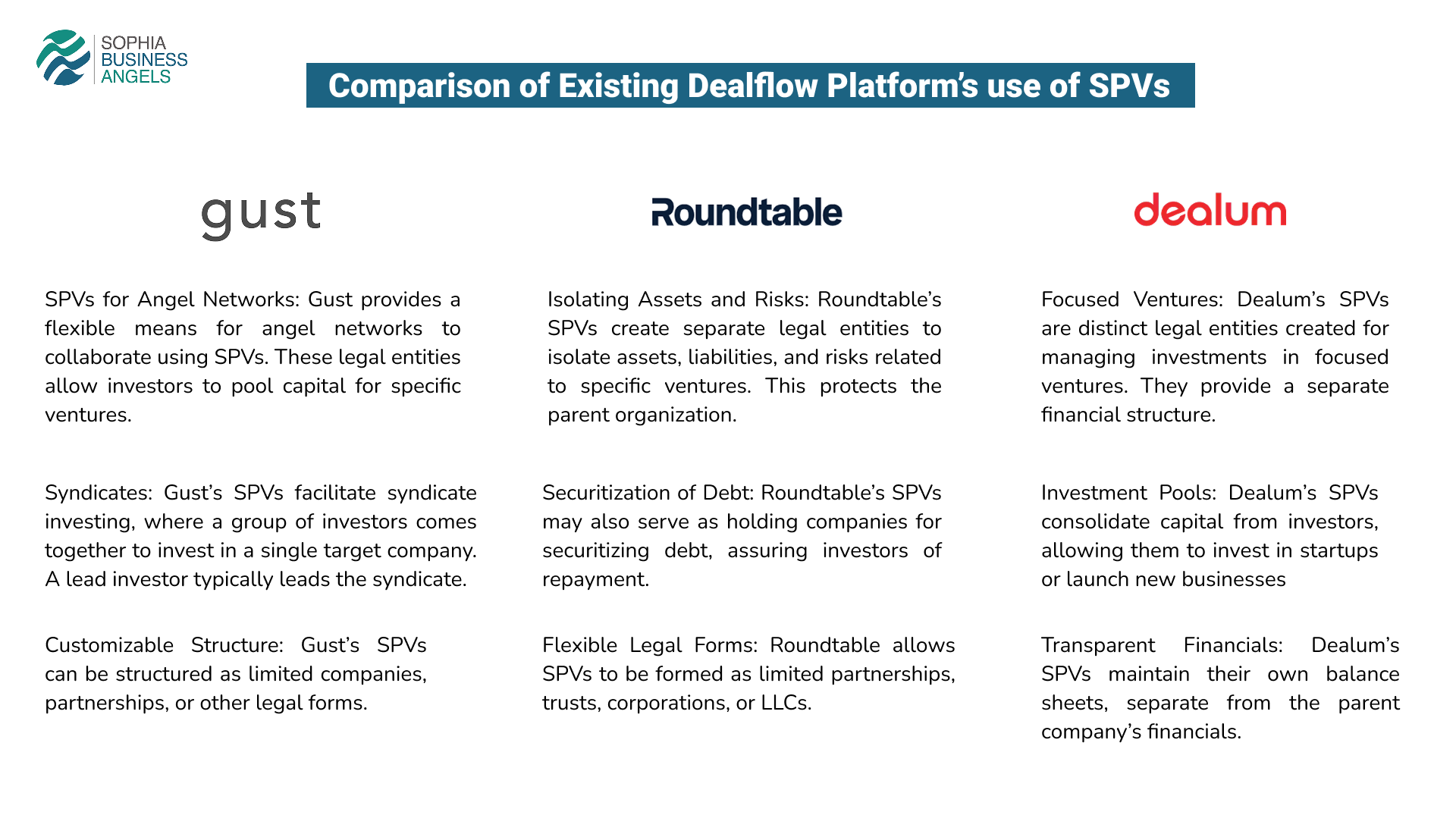
With this, I proceeded to design the digital private space by researching existing deal flow platforms and their UI as well as carry out another survey to understand what this space could provide.
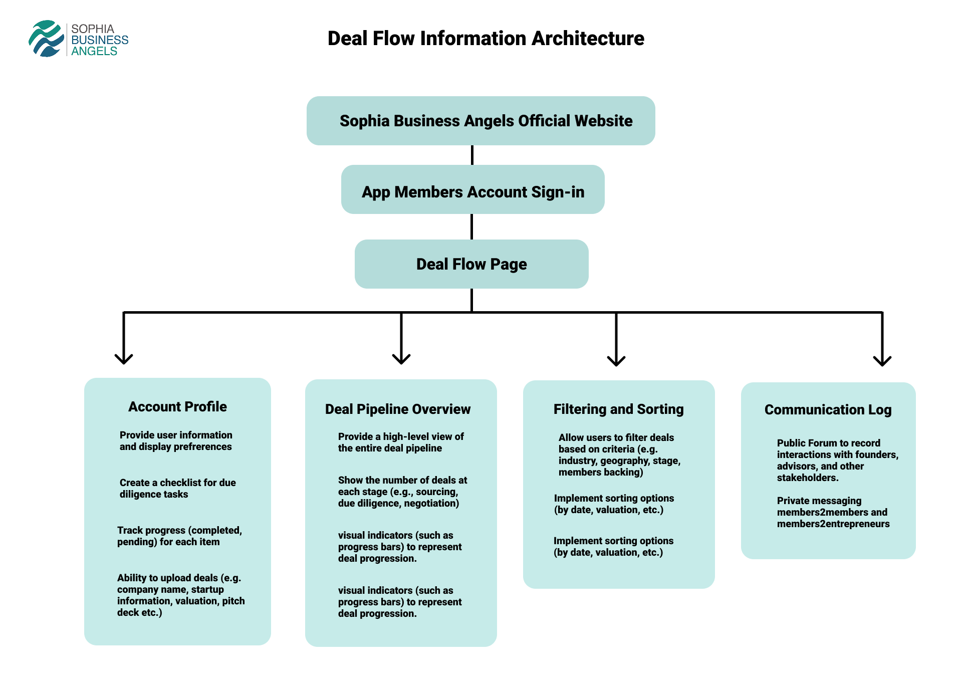
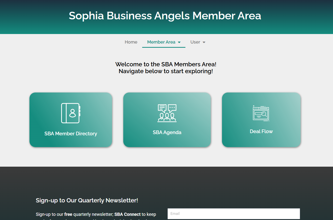
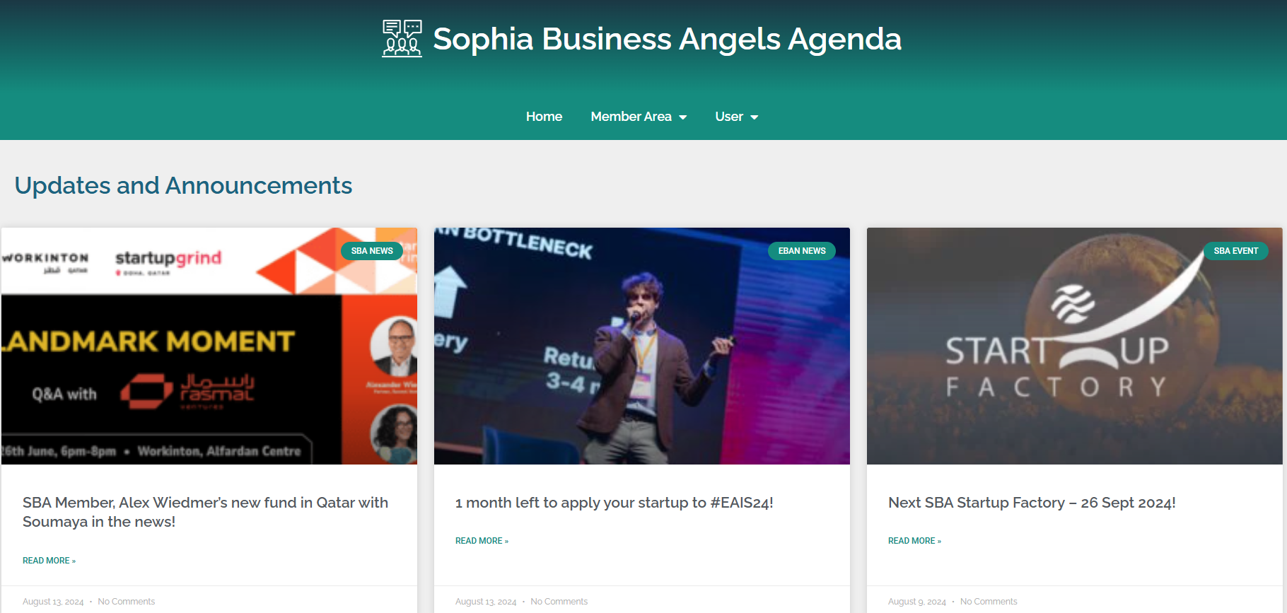
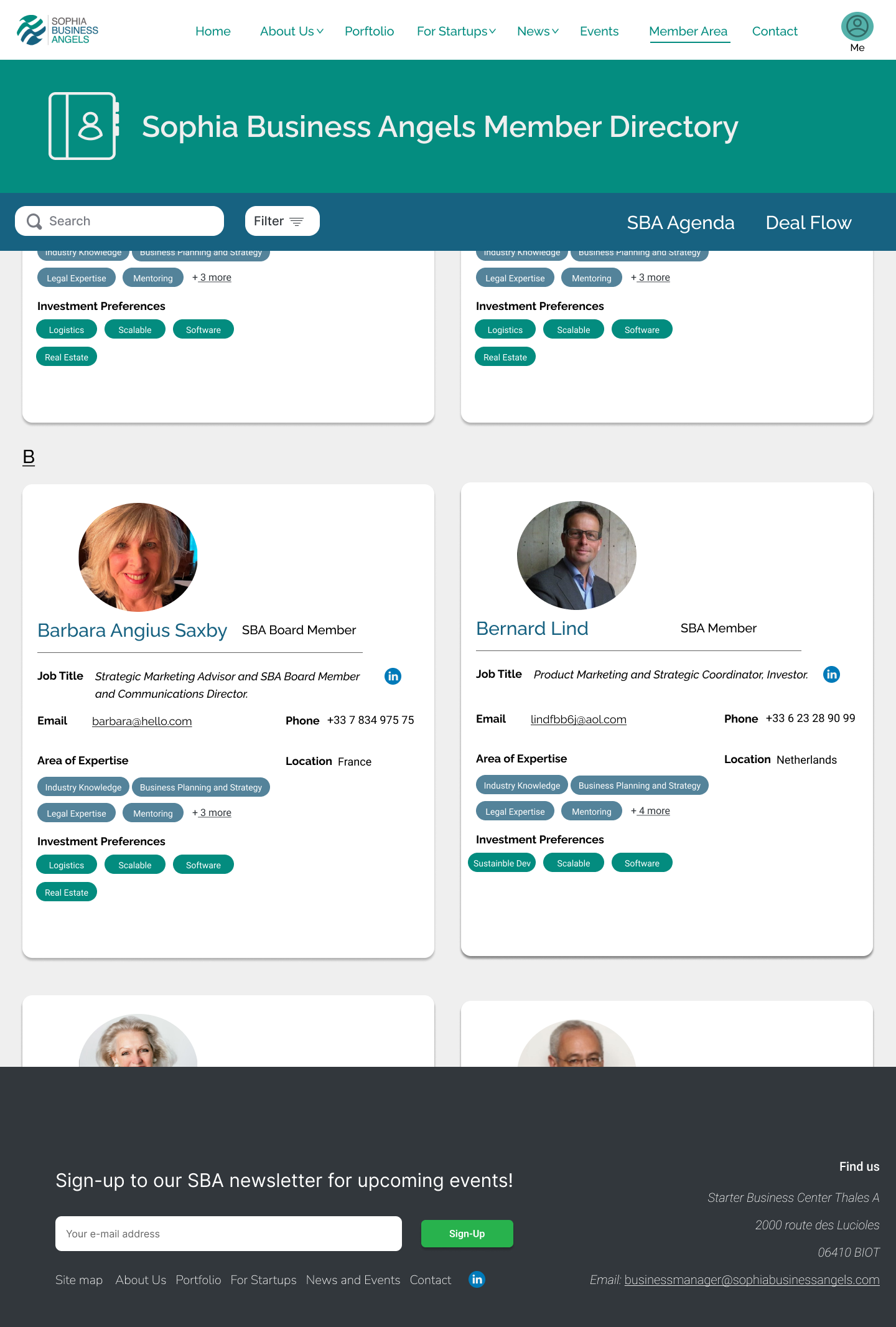
Based on the feedback, I designed three new pages in the member’s area; SBA Directory, SBA Agenda and SBA Deal Flow page.
The deal flow page was the most important and would require me to work closely with a senior developer who built the back-end of the page while I provided the design and code scripts to implement it.
The project was completed in a couple of months, and in order to facilitate members accessing this private area I provided individual and group onboarding workshops.

BEYOND THE WEBSITE
Building upon the approved designs, I proceeded to begin building the website using WordPress.
Being the first time using WordPress I spent my time researching the necessary tools, plugins and code scripts that I would require in order to ensure I could deliver on it’s basic functions such as displaying calendar events, newsletter subscription and other visual elements that were not readily available or required a subscription fee.
Furthermore the previous website had been running on an old PHP version which if updated would completely break the whole site down. This meant that I could not work directly on the existing website and so proceeded to first build the site staging environment directly on my laptop before transferring it online.
With that in mind I also proposed to switch to a different hosting plan that automates website security and plugin updates in order to minimize future risks as well reducing manual website maintenance.
Finally I made sure that the site map was registered in the Google search console for better SEO results and to keep track of user traffic and improve online visibility.